
Sparkline
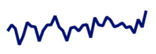
<Sparkline
    data={sales_by_date}
    dateCol=date
    valueCol=sales
/>
Examples
Connected Sparkline
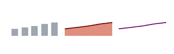
<Sparkline data={sales_by_date} dateCol=date valueCol=sales type=bar  valueFmt=eur dateFmt=mmm connectGroup=mysparkline/>
<Sparkline data={sales_by_date} dateCol=date valueCol=sales type=area color=maroon valueFmt=eur dateFmt=mmm connectGroup=mysparkline/>
<Sparkline data={sales_by_date} dateCol=date valueCol=sales type=line color=purple valueFmt=eur dateFmt=mmm connectGroup=mysparkline/>
Options
Data
data
REQUIRED
Query name, wrapped in curly braces
- Options:
- query name
dateCol
REQUIRED
Categorical column to use for the x-axis
- Options:
- column name
valueCol
REQUIRED
Numeric column to use for the y-axis
- Options:
- column name
type
Chart type for sparkline
Options:
- Default:
- line
emptySet
Sets behaviour for empty datasets. Can throw an error, a warning, or allow empty. When set to 'error', empty datasets will block builds in `build:strict`. Note this only applies to initial page load - empty datasets caused by input component changes (dropdowns, etc.) are allowed.
Options:
- Default:
- error
emptyMessage
Text to display when an empty dataset is received - only applies when `emptySet` is 'warn' or 'pass', or when the empty dataset is a result of an input component change (dropdowns, etc.).
- Options:
- string
- Default:
- No records
Formatting & Styling
color
Color to use for the visualization. For area sparklines, choose the color for the line and the area color will be automatically appplied in a lighter shade.
- Options:
- CSS name | hexademical | RGB | HSL
valueFmt
Format to use for value column (see available formats)
- Options:
- Excel-style format | built-in format name | custom format name
dateFmt
Format to use for date column (see available formats)
- Options:
- Excel-style format | built-in format name | custom format name
Axes
yScale
Whether to truncate the y-axis to enhance visibility
Options:
- Default:
- false
Sizing
height
Height of sparkline in pixels
- Options:
- number
- Default:
- 15
width
Width of sparkline in pixels
- Options:
- number
- Default:
- 50
Interactivity
interactive
Turn on or off tooltip behaviour on hover. If off, chart will be a staticly rendered SVG (better for page performance). If on, you will be able to see dates/values when hovering over the sparkline
Options:
- Default:
- true
connectGroup
Group name to connect this sparkline to other charts for synchronized tooltip hovering. Charts with the same `connectGroup` name will become connected
- Options:
- string