
Details
The details component allows you to add a collapsible section to your markdown. This is useful for adding additional information that you don't want to be visible by default.
Default state

Expanded state
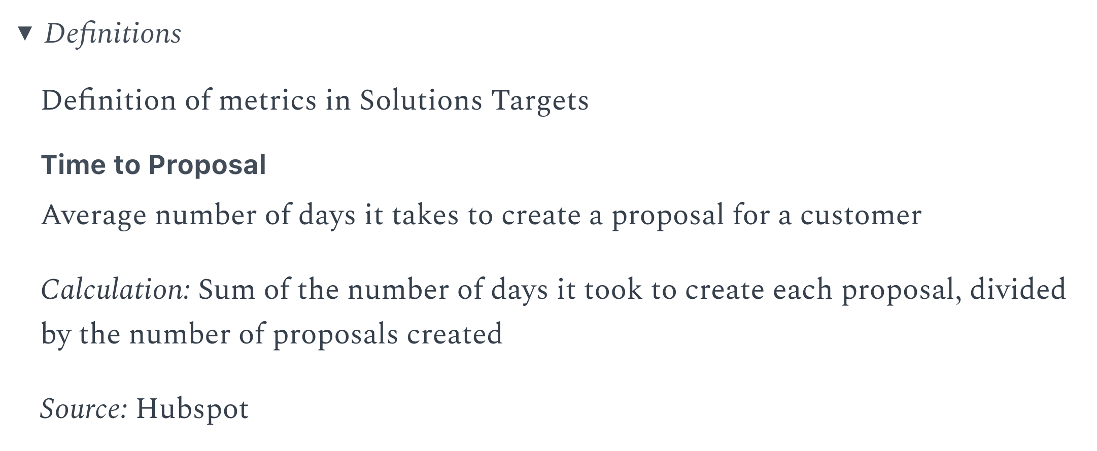
<Details title="Definitions">

    Definition of metrics in Solutions Targets

    ### Time to Proposal

    Average number of days it takes to create a proposal for a customer

    *Calculation:*
    Sum of the number of days it took to create each proposal, divided by the number of proposals created

    *Source:*
    Hubspot

</Details>
Options
title
The text shown next to the triangle icon.
- Default:
- Details
open
Whether expanded by default.
Options:
- Default:
- false